Delving into the realm of interior design, let’s uncover the top color palettes that are making waves in the US market. From calming neutrals to vibrant hues, these color schemes play a crucial role in shaping the ambiance of our living spaces.
As we explore the nuances of color psychology and the impact of natural light, we’ll gain a deeper understanding of how color choices can influence our emotions and perceptions within a room.
Most Popular Interior Color Palettes in the US Market
When it comes to interior design, color palettes play a crucial role in setting the mood and ambiance of a space. In the US market, certain color combinations have gained popularity for their ability to create a variety of effects.
Let’s explore the top 5 trending color palettes and their impact on mood and perception.
1. Neutral Palette
The neutral palette, consisting of whites, greys, and beige tones, is a timeless choice for interior design. This versatile palette creates a sense of calm and serenity, making it ideal for bedrooms and living rooms.
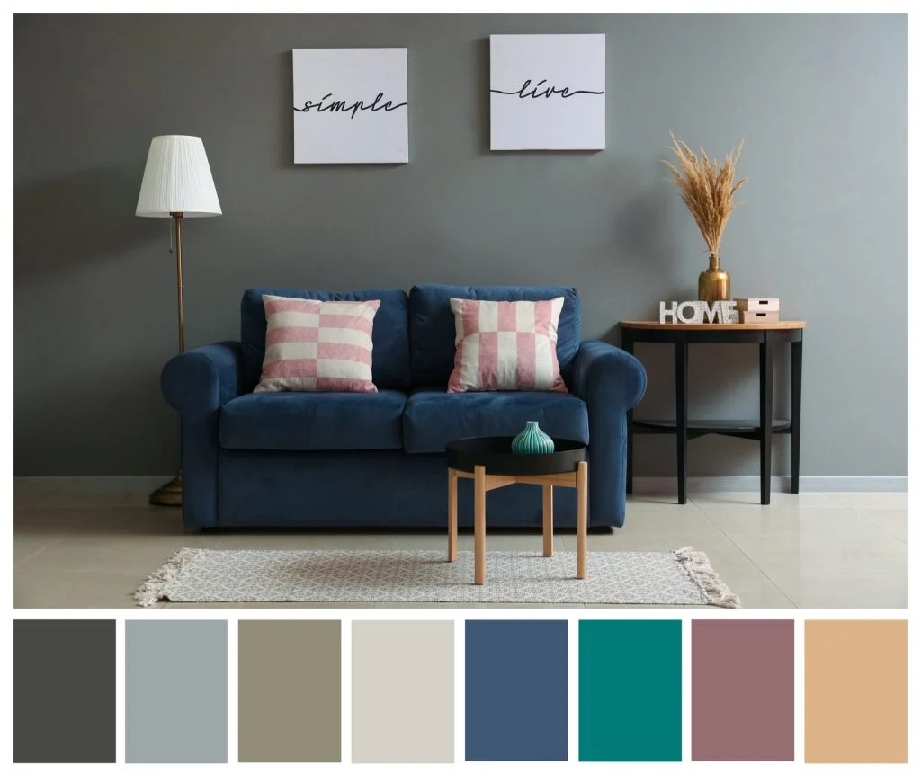
2. Blue and Grey Palette
Blue and grey color combinations evoke a sense of tranquility and sophistication. These calming hues are often used in home offices and bathrooms to promote focus and relaxation.
3. Earthy Tones Palette
Earthy tones like terracotta, olive green, and mustard yellow bring warmth and coziness to a space. These colors are commonly used in dining areas and kitchens to create a welcoming atmosphere.
4. Pastel Palette
Pastel colors like soft pink, mint green, and baby blue add a touch of sweetness and lightness to any room. This palette is perfect for nurseries and playrooms, creating a soft and nurturing environment.
5. Bold and Vibrant Palette
For those looking to make a statement, bold and vibrant color palettes featuring rich hues like deep red, emerald green, and royal blue can add drama and personality to a space. These colors are often used in accent walls or eclectic living areas.
Influential Factors in Choosing Interior Color Palettes
When it comes to choosing interior color palettes, there are several influential factors to consider that can greatly impact the overall look and feel of a space. Factors such as natural light, color psychology, and cultural influences all play a significant role in determining the perfect color scheme for a room.
Natural Light and Color Perception
Natural light has a profound effect on how colors are perceived in a room. The intensity and direction of light can alter the way colors appear, making it essential to consider the amount of natural light that enters a space when selecting a color palette.
Rooms with ample natural light can handle bolder and darker colors, while rooms with limited light may benefit from lighter shades to create a more open and airy feel.
Color Psychology in Interior Design
Color psychology plays a crucial role in choosing appropriate color palettes for different rooms. Certain colors evoke specific emotions and moods, influencing how people feel in a particular space. For example, cool tones like blues and greens are known to promote relaxation and tranquility, making them ideal for bedrooms and living rooms.
In contrast, warm tones like reds and oranges can create a sense of energy and warmth, making them suitable for areas where socialization and activity are encouraged.
Cultural Influences on Color Choices
Cultural influences also impact the choice of color palettes in interior design. Different cultures have varying perceptions of color symbolism and meaning, leading to preferences for certain colors over others. For example, in Eastern cultures, red is often associated with luck and prosperity, while in Western cultures, white is commonly linked to purity and simplicity.
Understanding these cultural nuances can help in creating spaces that resonate with a specific audience or demographic.
Application of Color Theory in Interior Design
Color theory plays a crucial role in interior design, helping designers create harmonious and visually appealing spaces. Understanding concepts like hue, saturation, and value is essential for selecting the right color palettes for different rooms in a home.
Concepts of Hue, Saturation, and Value
In interior design, hue refers to the actual color of an object, such as red, blue, or green. Saturation, on the other hand, determines the intensity or purity of a color, with highly saturated colors appearing vivid and bold. Value relates to the lightness or darkness of a color, influencing how it interacts with light and other colors in a space.
Principles of Color Harmony
Color harmony involves creating a pleasing visual balance by combining colors in a way that complements each other. Designers often use color schemes like complementary (opposite colors on the color wheel) or analogous (colors adjacent to each other) to achieve harmony in interior spaces.
These principles guide the selection of paint colors, furniture, and decor to create a cohesive look.
Tips for Creating a Cohesive Color Palette
- Start by choosing a base color for the entire home and use it as a foundation to build upon with other hues.
- Consider the mood and ambiance you want to create in each room when selecting color schemes.
- Use a mix of neutral tones, bold accents, and varying shades to add depth and interest to the space.
- Experiment with different textures and finishes to enhance the visual appeal of the colors used.
- Don’t be afraid to play with color, but ensure there is a sense of balance and cohesion throughout the home.
Emerging Trends in Interior Color Palettes
As the interior design landscape evolves, new color combinations are gaining popularity in the US market, shaping the way spaces are being designed and decorated. Sustainability and eco-friendliness are playing a significant role in influencing color choices, while technology like virtual reality is revolutionizing the visualization and experimentation of different color palettes.
New Color Combinations
Interior designers are exploring bold and unexpected color pairings to create unique and visually striking spaces. Combining rich jewel tones with earthy neutrals, such as emerald green with warm terracotta, or navy blue with sandy beige, adds depth and sophistication to interiors.
Influence of Sustainability
Sustainability has become a key consideration in interior design, leading to a shift towards natural, eco-friendly color choices. Soft, calming hues inspired by nature, like soft greens, warm browns, and earthy blues, are increasingly popular as they promote a sense of well-being and connection to the environment.
Technology in Color Visualization
Advancements in technology, particularly virtual reality, are revolutionizing the way designers conceptualize and experiment with color palettes. Virtual reality tools allow designers to virtually walk through spaces with different color schemes, helping them make more informed decisions and visualize the final look before implementation.
Last Point
In conclusion, the world of interior color palettes is a fascinating blend of art, science, and personal expression. By understanding the trends, psychology, and application of color theory, one can truly transform a living space into a harmonious sanctuary that reflects individual style and creativity.
FAQs
What are the key factors to consider when choosing an interior color palette?
Factors such as natural light, color psychology, and cultural influences play a significant role in selecting the perfect color scheme for a room.
How can one create a cohesive color palette for their home?
By understanding concepts like hue, saturation, value, and color harmony, one can create a balanced and visually appealing color palette for their entire home.
Are there any emerging trends in interior color palettes?
Yes, new color combinations influenced by sustainability, eco-friendliness, and even technology like virtual reality are gaining popularity in the US market.


